Visual Hierarchy in Graphic Design 101

- Using visual hierarchy in graphic design, different graphic elements are arranged inside a composition to establish a visual hierarchy based on their importance, guaranteeing that the most significant information is seen first by the spectator.
- Prioritizing visual hierarchy becomes essential because consumers typically view a design for eight seconds on average. It is crucial to remember the short timeline when creating a design and expertly arranging the components based on their significance.
- This well-thought-out layout helps the audience comprehend the main points while simultaneously grabbing their attention. Furthermore, a strong visual hierarchy and an engaging and understandable design message are conveyed through the efficient use of contrast, color, and typography.
07 Visual Hierarchy principles:
1. Size and Scale
2. Color and Contrast
3. Typographic Hierarchy
4. Spacing
5. Alignment
6. Repetition
7. Rule of Thirds
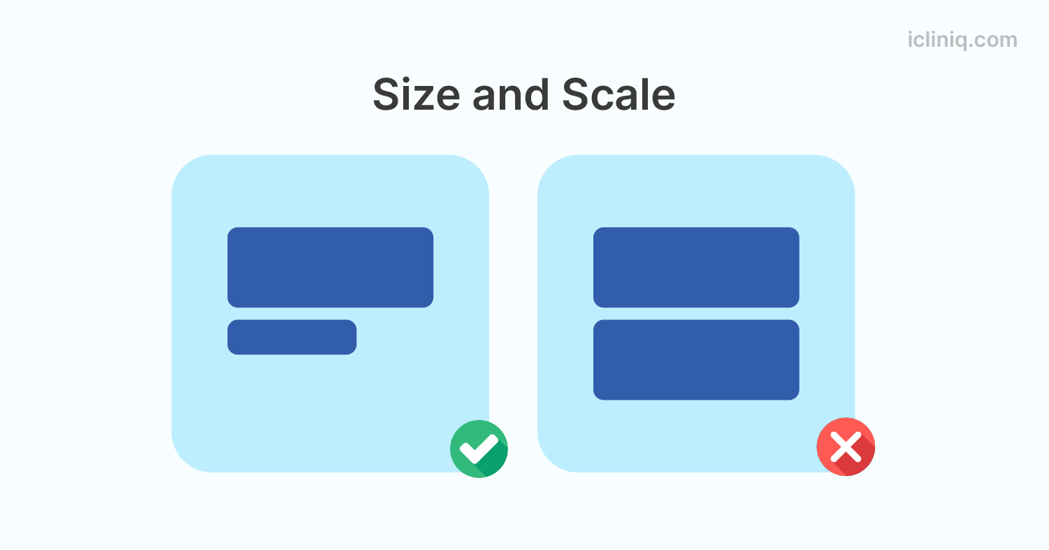
1. Size and Scale
Size and scale are essential in guiding the viewer's gaze, helping to identify critical components and enabling a concentrated comprehension of the primary information in the design.
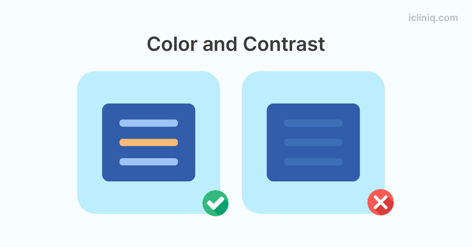
2. Color and Contrast
In terms of visual hierarchy, the deliberate use of color and contrast in a design composition directs the viewer's attention to particular graphic elements. This is accomplished using contrasting color schemes, ensuring that the most important aspects are highlighted with bolder hues, increasing their visibility and visual impact.
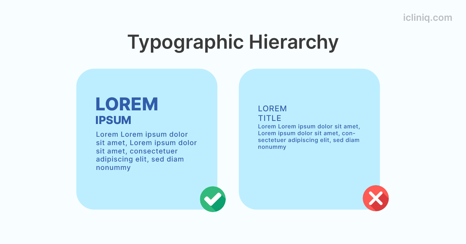
3. Typographic Hierarchy
Typographic hierarchy is an organized method used in graphic design that uses typography to organize information and visually indicate priority within the design. With this technique, you must ensure that the title—the most crucial element—is displayed more prominently than the body text. This intentional difference in size helps visitors quickly recognize and understand the main idea of the design.
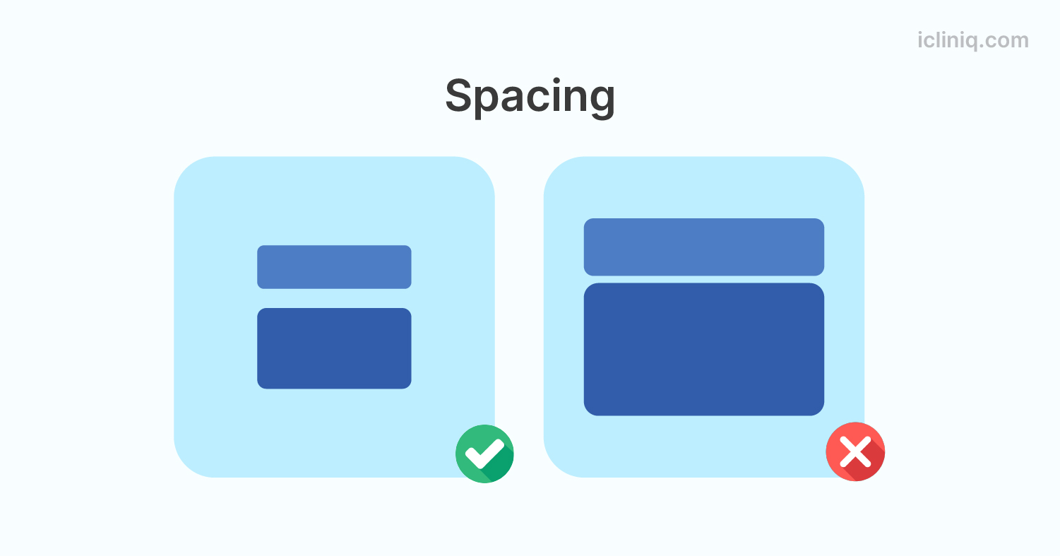
4. Spacing
Spacing is essential to give each visual element enough room to breathe. In addition to improving the overall look, this deliberate spacing makes it easy to identify each design element.
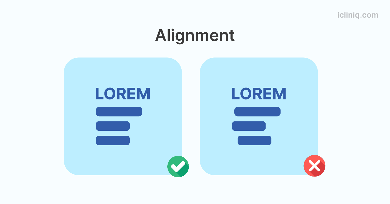
5. Alignment
In graphic design, alignment is the deliberate placement of text and graphic components inside a composition to preserve visual coherence. Good alignment makes the design more visually appealing overall and improves readability by making it easier for the viewer to recognize and interact with the critical elements.
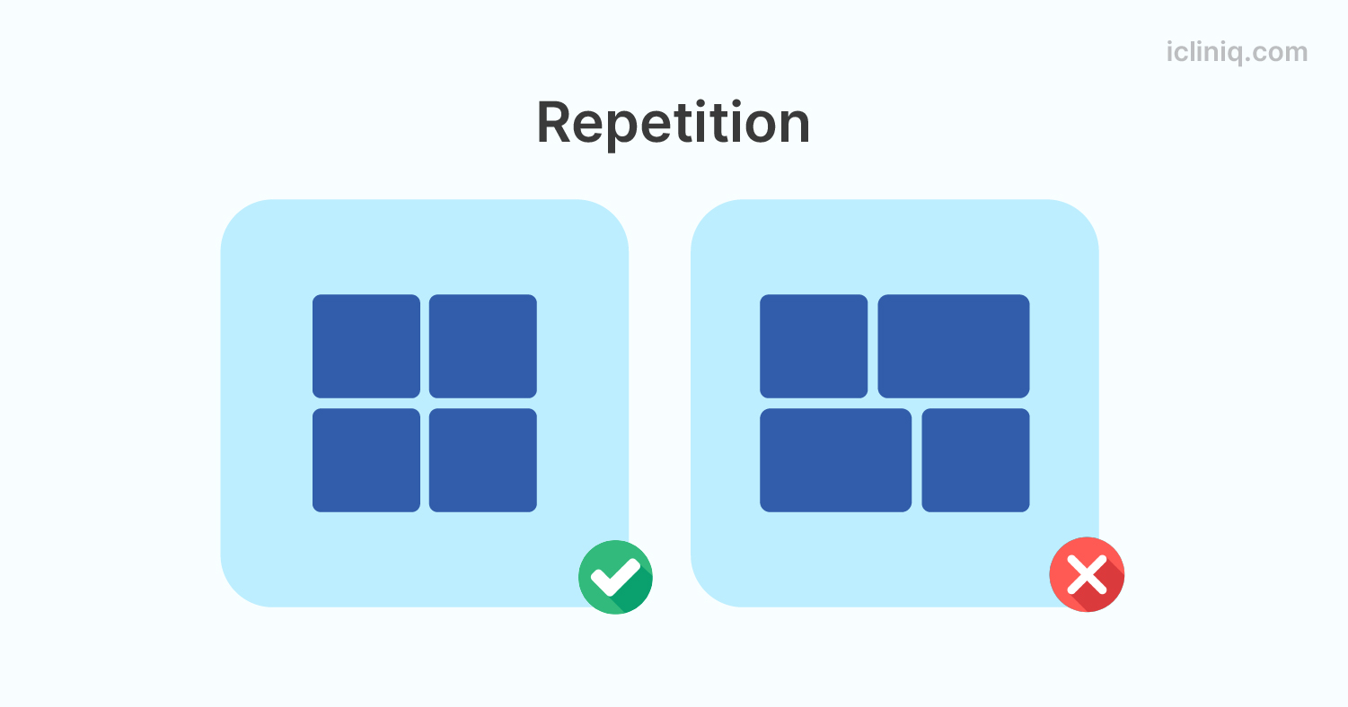
6. Repetition
Repetition is the methodical use of different graphic elements in a composition to create a unified and recognizable visual style.
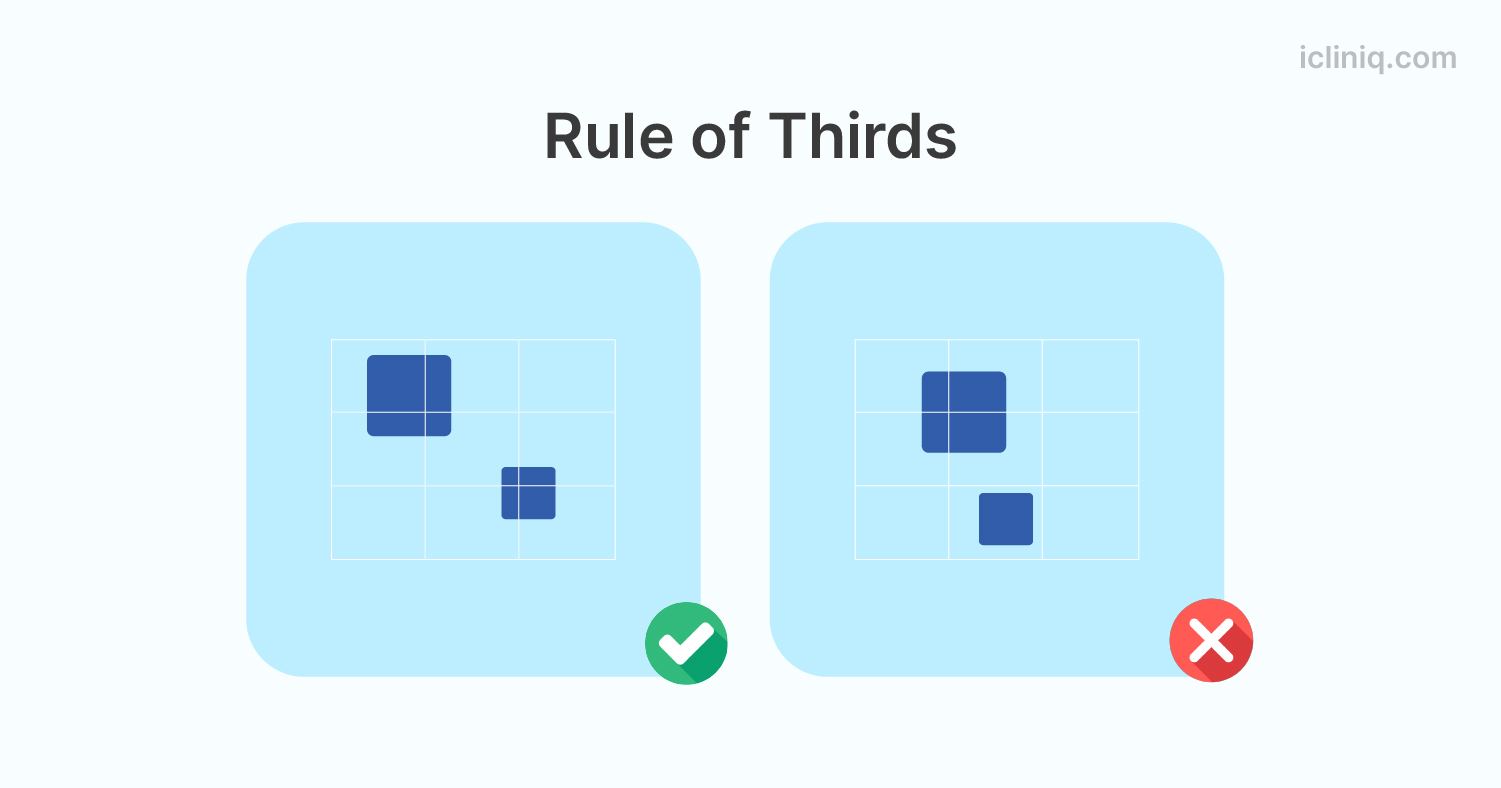
7. Rule of Thirds
In graphic design, the composition is divided into three rows and columns, complying with the rule of thirds. The point of convergence is where the focal points are placed to give the spectator a striking visual effect.